Confluence Coffee
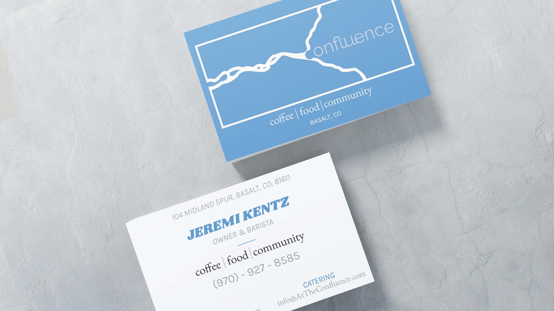
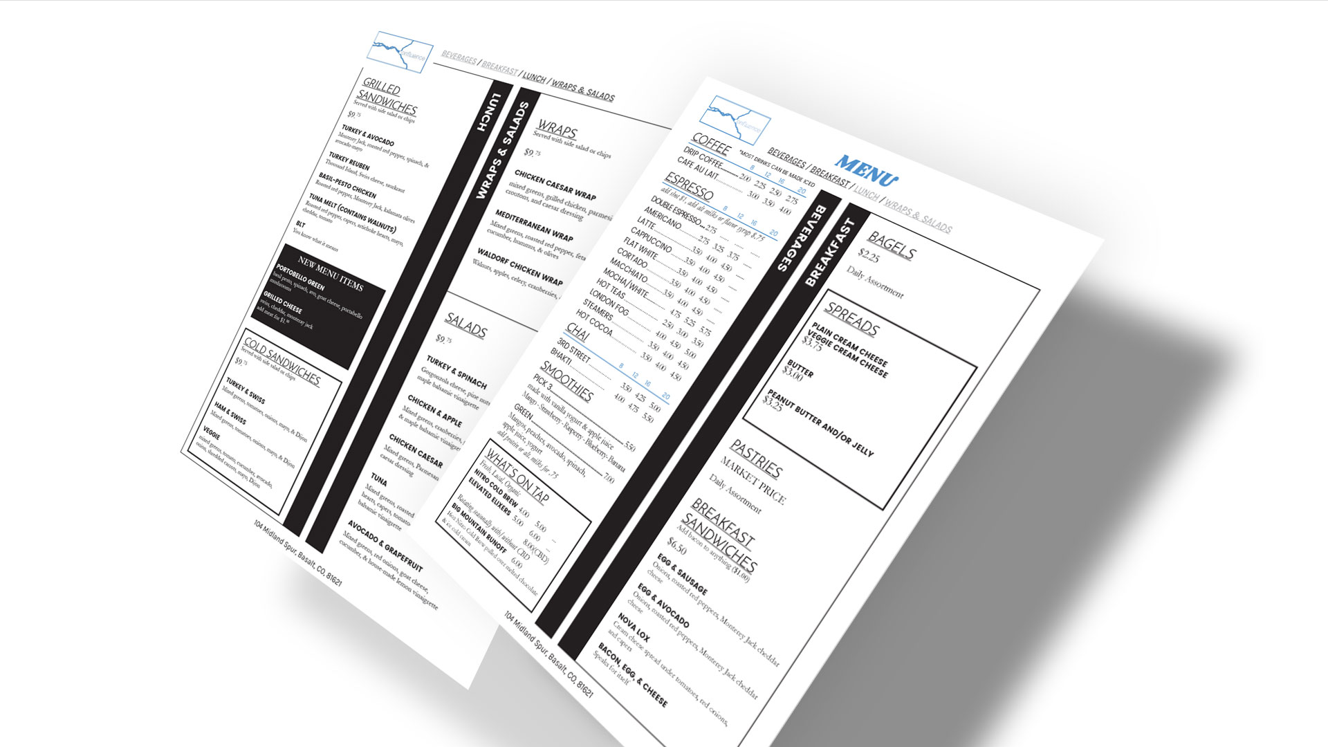
New cafe wanted a fresh, new, modern look for their location and website. They wanted to reflect the physical location of the shop, at the confluence of two rivers, and also wanted to have a clean, spacious, and welcome look that incorporated the shade of blue.
Logo
For the logo, I decided to use a one color logo with transparency because the logo was to be used as a stamp, so the shape was extremely important. I used a rectangle to bound the rivers together, and opened it at the main river to show openness. I decided to join the letters in f, l, u, and e to show unity and togetherness. I also created a negative space with the "c" at the beginning of the word to attract and integrate the word into the actual river itself.
Website
I used a wide-screen layout to emulate spaciousness, used a collapsed menu with a center, more action-oriented small menu that is bold and incorporated the brand's typography. The look and feel of the brand is openness and welcome, so I made sure the photography focused on not just the product but the atmosphere as well. The purpose of the website was to give information quickly to visitors who are in a hurry, so I made the menu the very first navigational item on both mobile and desktop.


